

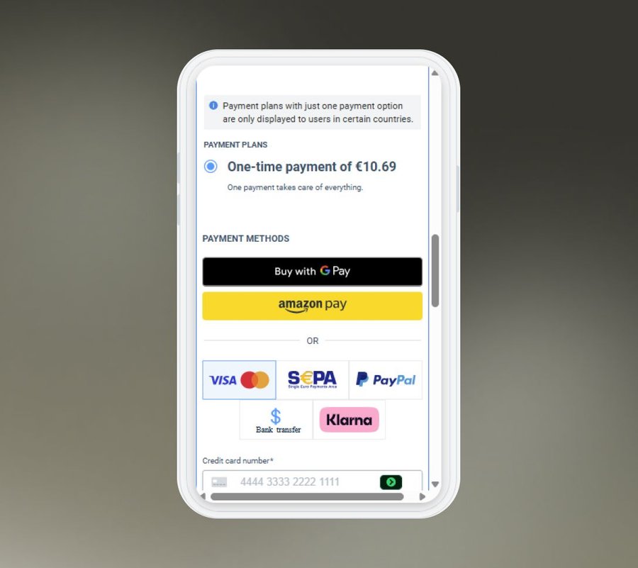
Most order form tools require separate mobile setups or CSS adjustments to display correctly on small screens. Cart Builder's responsive format handles this automatically, detecting the buyer's screen and adapting layout, fields, and widget placement on the fly. No CSS, no developer, no separate mobile version to maintain.
Sell on Any Device
A checkout that doesn't work on mobile is a sale you don't make. Cart Builder's responsive format adapts every element of your order form automatically—desktop, tablet, or phone—with no extra configuration needed.
How it Works
Fully Mobile Responsive
- Automatic device detection. Layout, fields, and widgets adjust to any screen the moment a buyer lands on your checkout. No manual adjustments, no code.
- All 20+ widgets, fully optimized. Every Cart Builder widget renders correctly across all major devices and browsers. No broken layouts, no missing elements.
- One form, every device. Update your order form and changes apply across desktop, tablet, and mobile instantly.
Main Benefits
Every Device, Every Sale
A checkout that works everywhere converts everywhere.
01
Never Lose a Mobile Sale02
Zero Configuration Required03
Build Once, Sell Everywhere

Ready to Sell on Every Device?
Digistore24 powers sales across 180 countries on every device, backed by 99.99% uptime on AWS infrastructure. Build a checkout that never lets a mobile buyer down.
Continue Exploring
More Brands Features
- Refund & Chargeback Management
- Merchant-of-Record & International Compliance
- Automatic Tax Calculation & Filing
- Automated Accounting & Invoicing
- Automated Affiliate Payouts
- Reliable Payment Processing
- Legal & GDPR Compliance
- Billing & End-Customer Support
- Fraud Prevention
- Custom Employee Access Rights
- Ultra-Secure Servers That Never Go Down